Brought on to redesign a figure skating app that turns motion tracking into performance metrics for athletes and partnered with engineers on handoff.
Skaters train on feel, not data. I was brought on to redesign an app that uses motion tracking to measure metrics like rotational velocity, tested with video from MIT’s figure skating team, so athletes can compare their performance to Olympians. I partnered with engineers through handoff.
- Oct - Apr 2025
- Timeline
- UX Designer/Researcher
- Role (Team Size: 10+)
- Wireframes/ SwiftUI code
- Deliverable
Designed with:
Handoff/Built with:

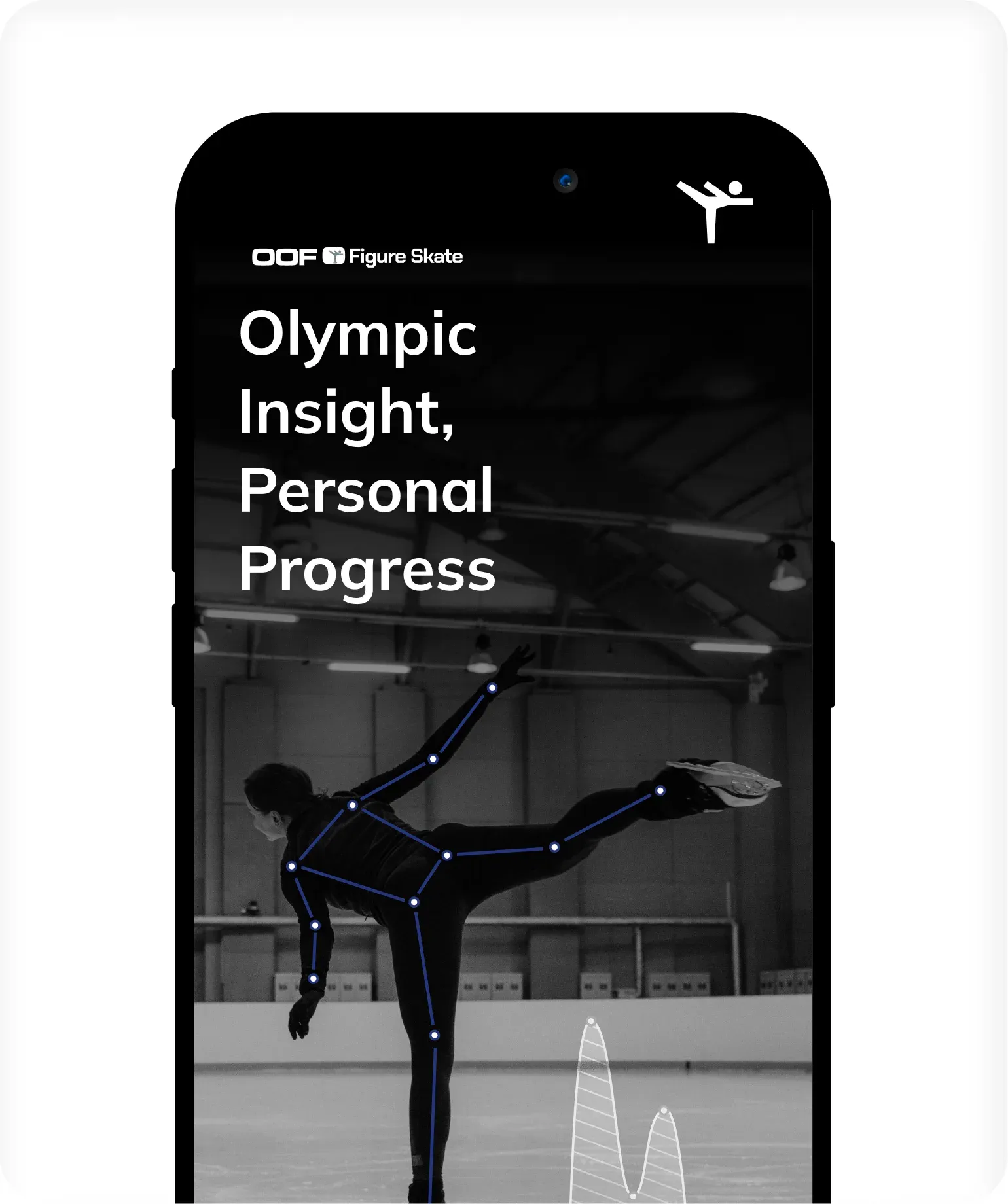
Overview
Every Jump Has Data. Skaters Never Get To See It.
I joined the MIT Sports Lab’s figure skating project midway through, recruited as the only UX designer on a team of engineers and researchers already familiar with the app. Over 6 months, I helped to redesign an app that turns motion-tracking data from skaters’ jumps and spins into performance metrics for skaters, parents, and coaches.
Problem: Skaters and coaches had powerful motion data but no clear way to read it, and had a desire to compare metrics with the pros.
Motion tracking can capture metrics like rotational velocity that the eye can’t see. But the numbers were buried in an interface built by engineers, for engineers, so the people who needed them most couldn’t easily turn the data into feedback on the ice, such as comparing their performance to Olympic athletes.
Opportunity: Make performance data something skaters can understand and act on
When skaters review a jump, they want to know what went right, what went wrong, and how they compare to the best. With performance video from the MIT Figure Skating Team for testing, and Olympic athletes as benchmarks, a redesigned app will:
- Turn raw metrics into clear visuals
- Let skaters compare themselves to Olympic athletes
- Give coaches feedback they can use in practice
Joining Midway
The Only Designer In A Room Of Engineers:
Walking into a project like this one almost felt like joining a conversation halfway through, I needed to learn how to progress forward while taking the time to understand the context. As the only designer, my first job wasn’t to design immediately. Instead, it was to listen, ask questions, and learn how the team thought about their users (skaters), data, and what a finished product looked like to them.
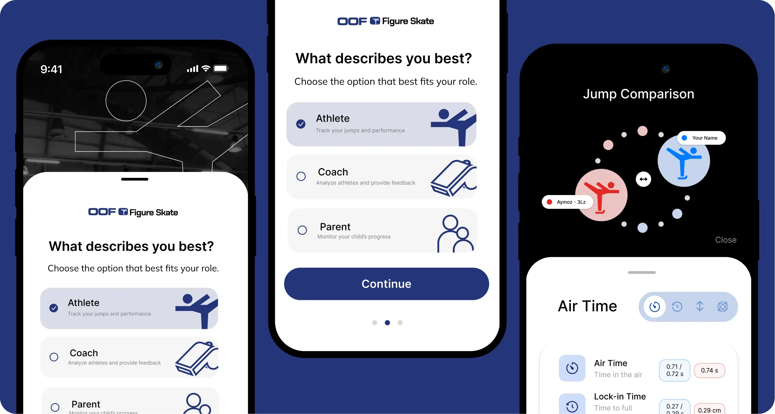
[Redesigned Screens - Sample]
Leading Brainstorms
Learning To Lead Cross-Team Design Discussions
In October, I traveled to MIT to meet the team in person. When the conversation turned to design direction and what my role would be, everyone looked to me. I had never led a design session on my own, so my first instinct was to write everything down in my notes app and figure it out later.
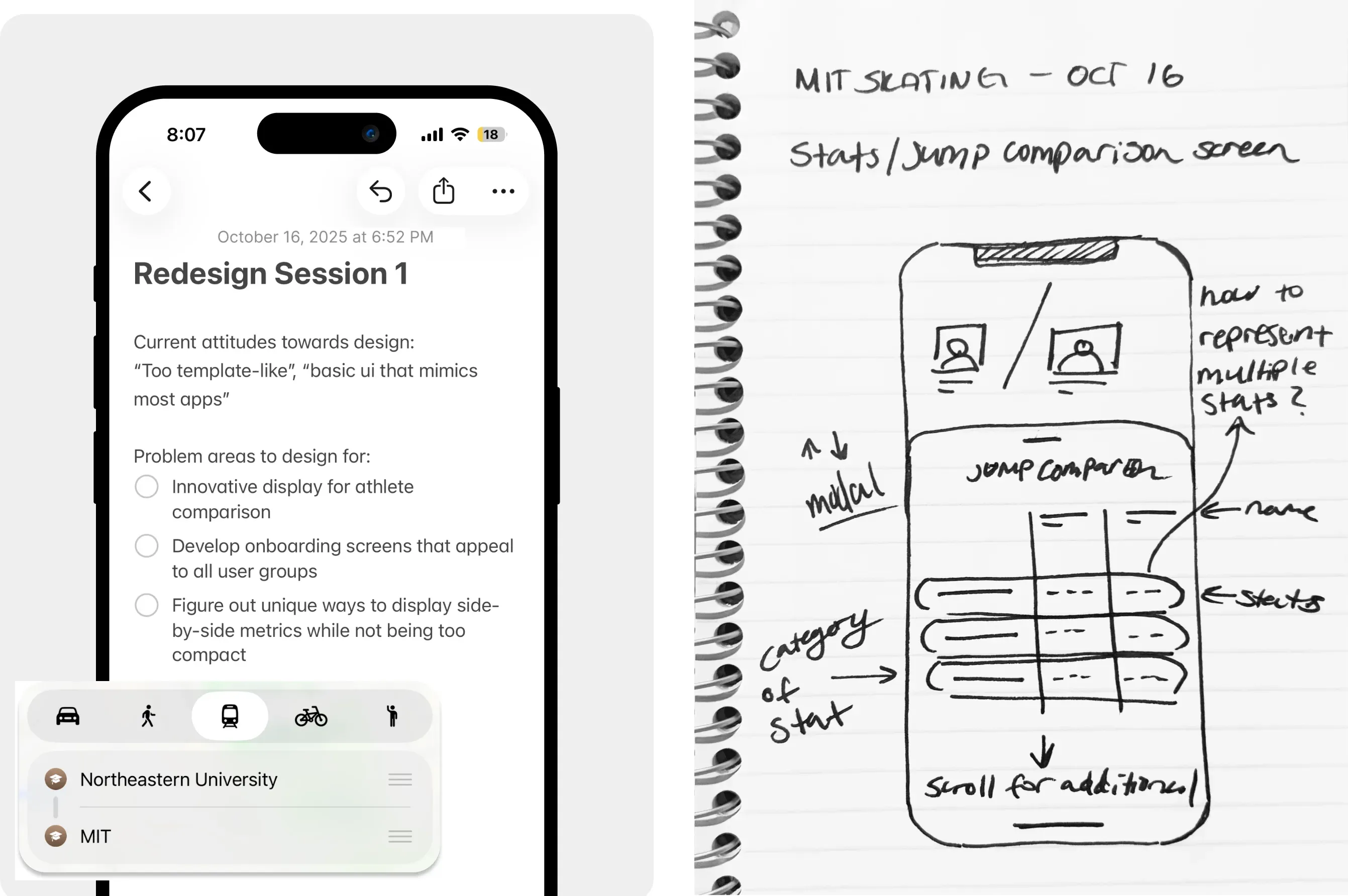
[Sample of my first set of notes taken on my iOS Notes App and a page from a set of hand drawn mocks, written and sketched as the team talked]
Back home, I read through my notes and realized something was missing: the engineers.
I had captured what they said, but I hadn’t truly designed with them. So I started scheduling live brainstorming sessions with the two project/engineer leads, where ideas could be shaped together in the moment instead of interpreted afterward.
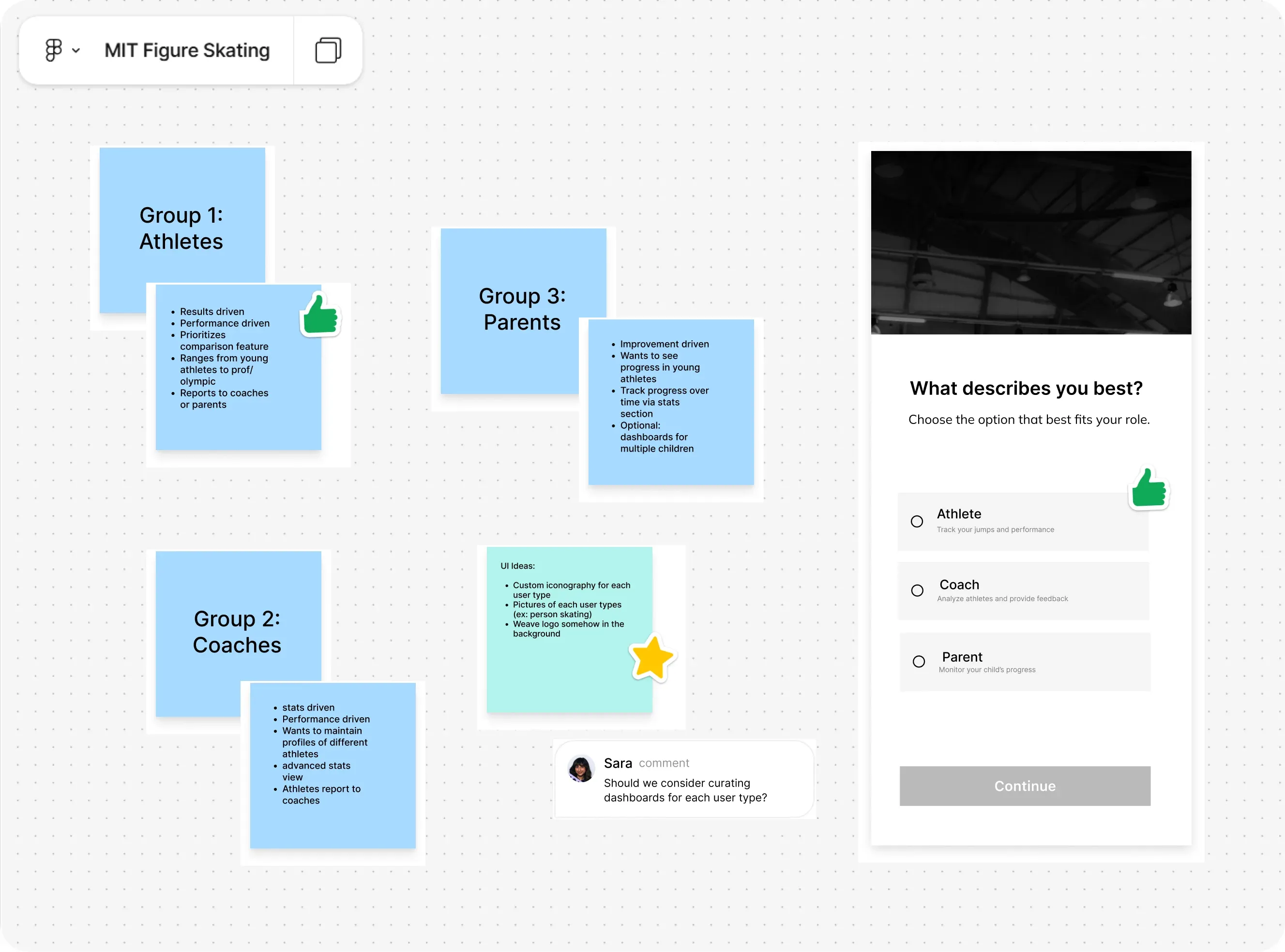
[Example Screenshot of an early ideation session on FigJam]
My goal was to turn sessions from me sketching mocks to a more collaborative experience. Moving our brainstorms into FigJam changed how the team took part. Engineers who had been quiet in early sessions started adding their own notes and references to the board. Seeing everyone’s ideas in one place made it easier to spot patterns, settle friction, and decide what to design next.
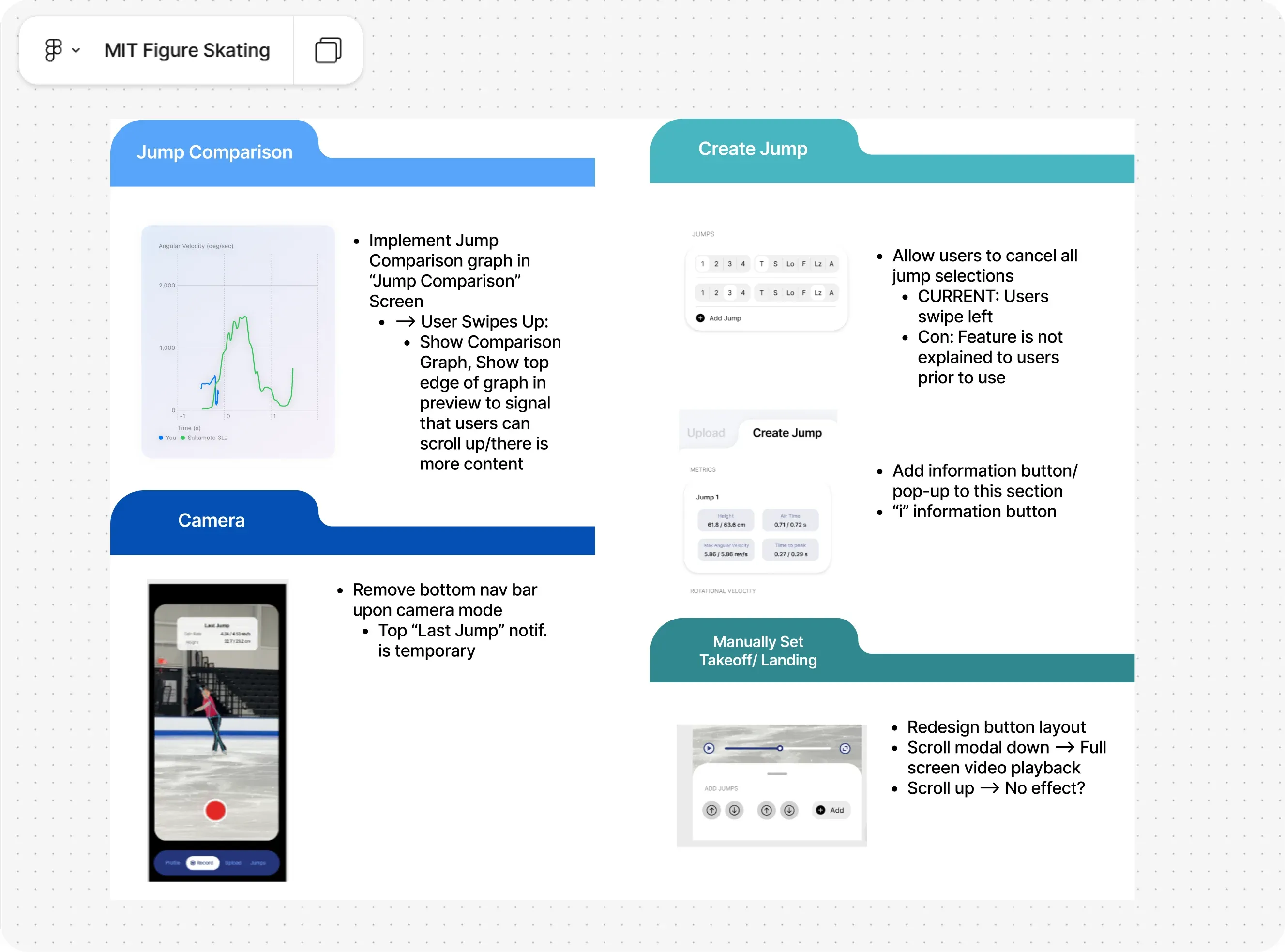
[Example Screenshot of an early ideation session on FigJam]
Design Direction
Bringing Our Research And Design Ideation To Life
With ideas from every session collected in FigJam, sketches, and notes, the next step was turning them into one clear direction. I pulled out the themes that kept showing up and used them to rethink the app’s existing screens.
Drag the slider below to compare the original designs with where that direction took them!
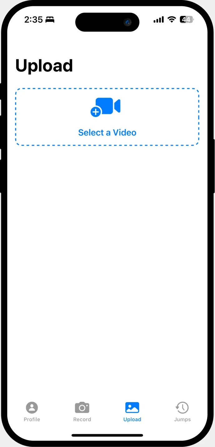
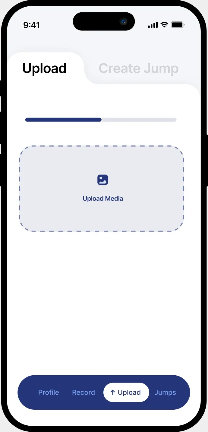
Upload Performance Screen
Previous:Does not show upload progress,Unclear progression to next screen
New:Establishes steps from “Upload” to “Create Jump” screen
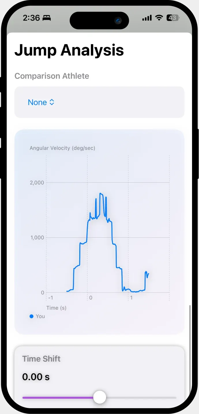
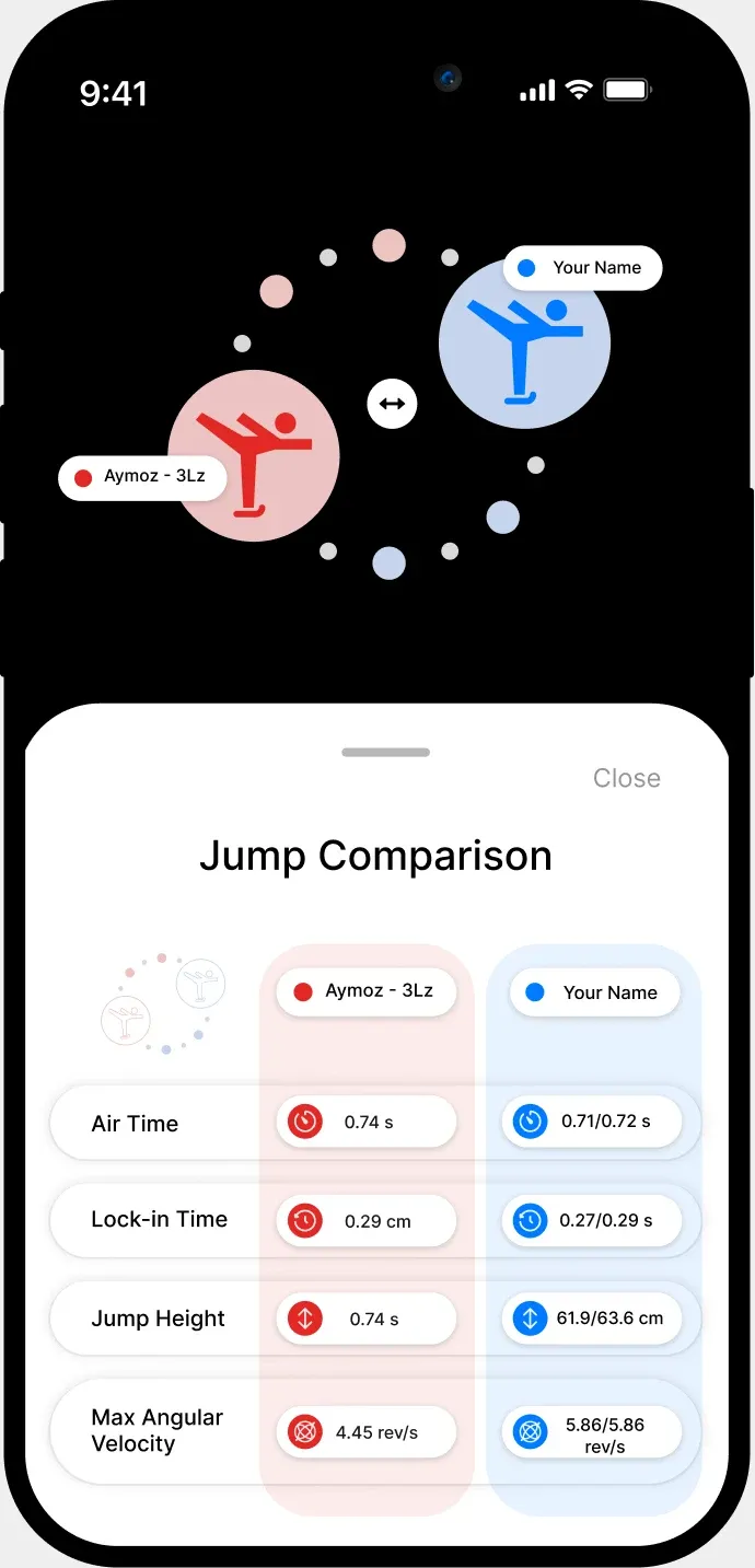
Jump Comparison Screen
Previous:Unclear representation of where the user falls compared to selected athlete
New:Integrates branding with a clearer comparison with easy to read data
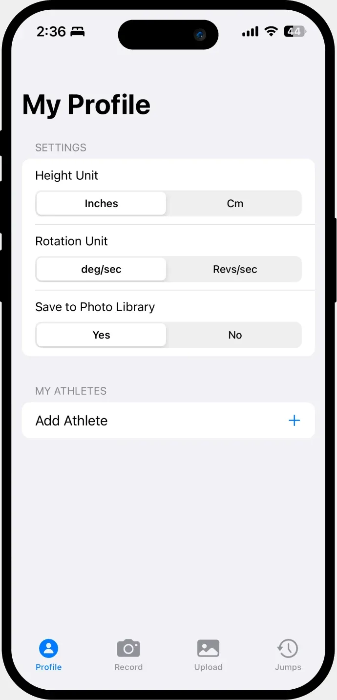
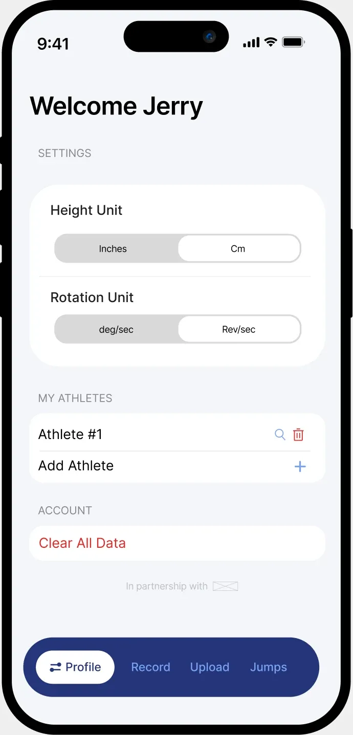
Profile Screen
Previous:Not personalized to user, branding inconsistent with logo
New:Includes the user’s name for a friendly appearance, “Clear Data” button for users to remove athletes
Onboarding Flow:
Based on our brainstorming sessions, and identifying our three main user groups, we decided to develop an onboarding experience that adapts the UI to the user’s needs.
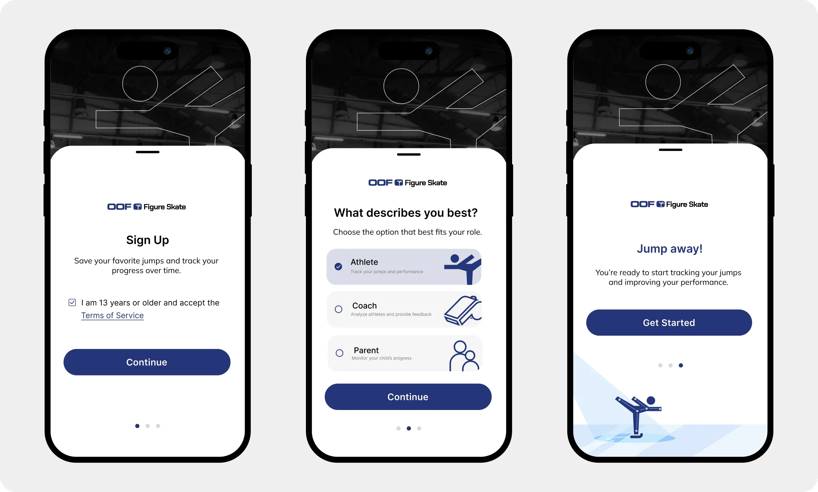
[Example Screens: Onboarding]
Establishing a Brand Book
As the only designer on the team, aside from my UX/UI tasks, I was also assigned the job of creating a brand book for the project, as well as iOS banners for the App Store.
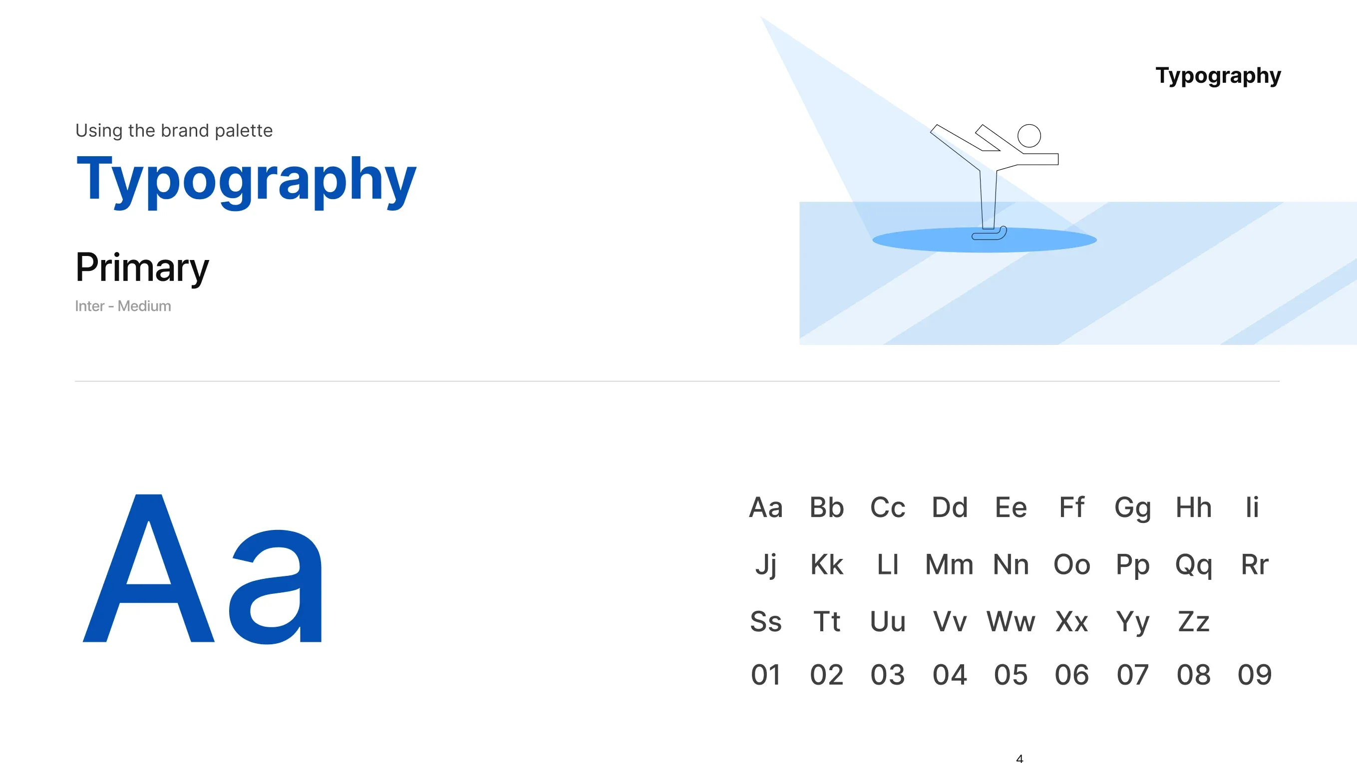
[Brand Book Sample Page]
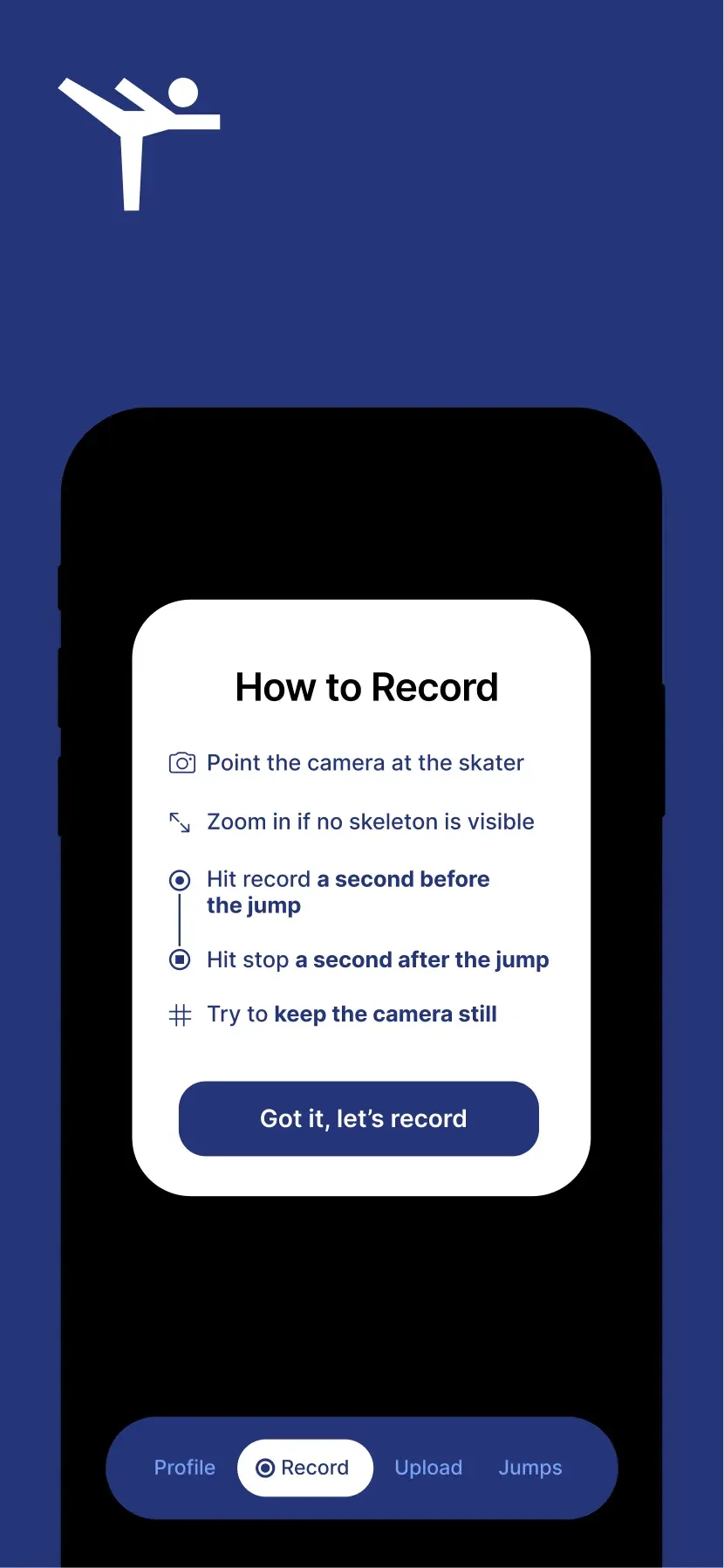
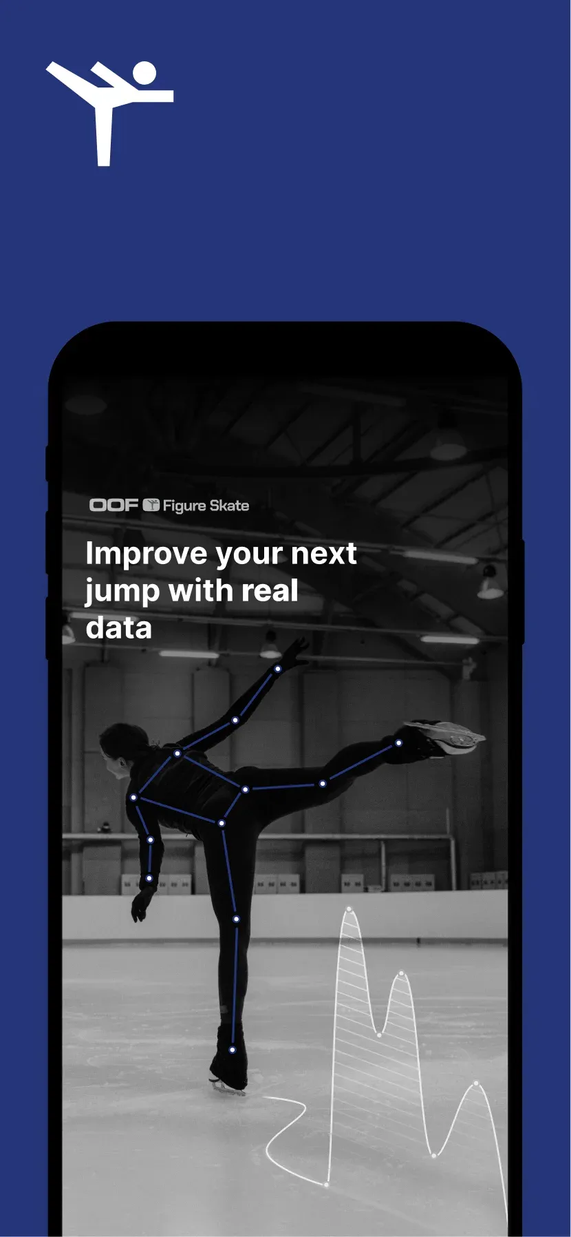
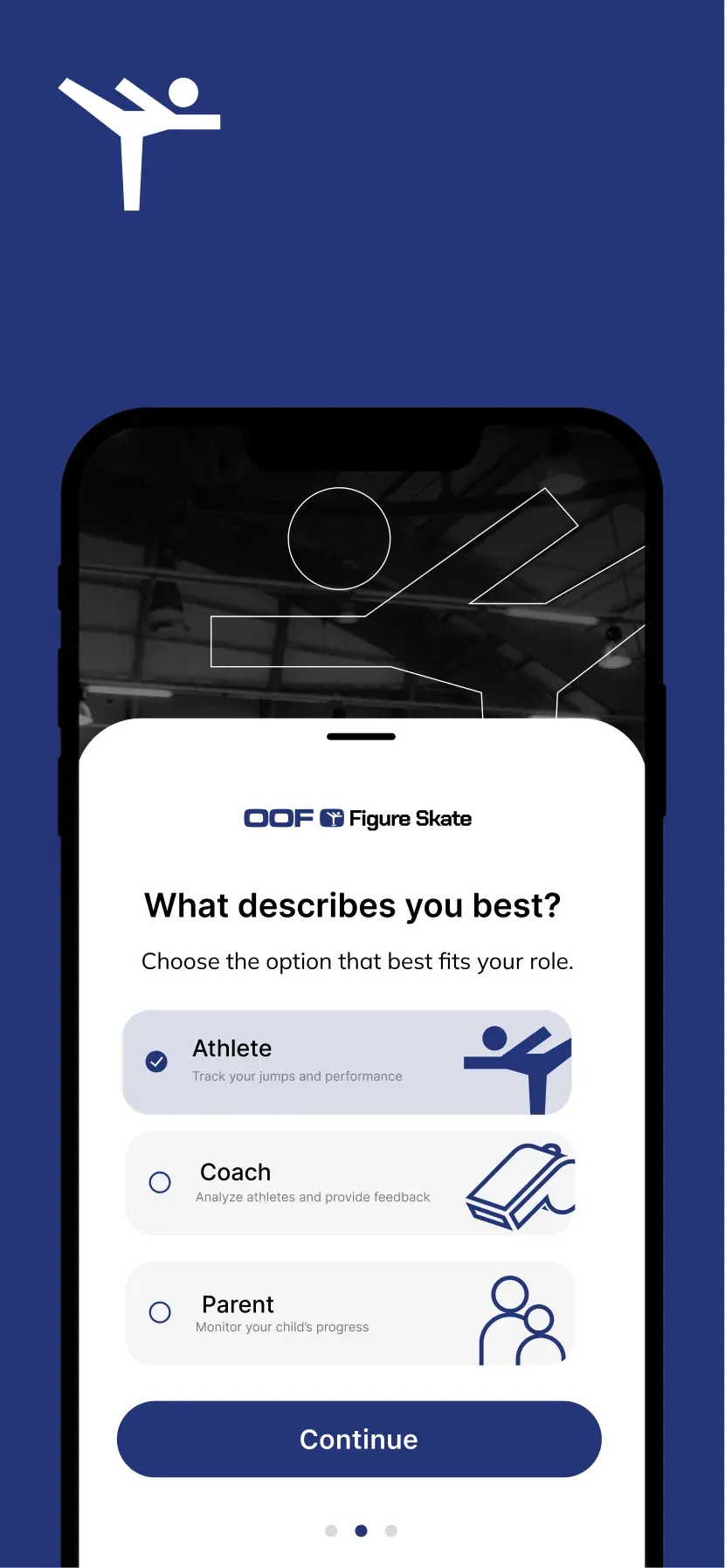
[Sample of iOS App Store Banners]
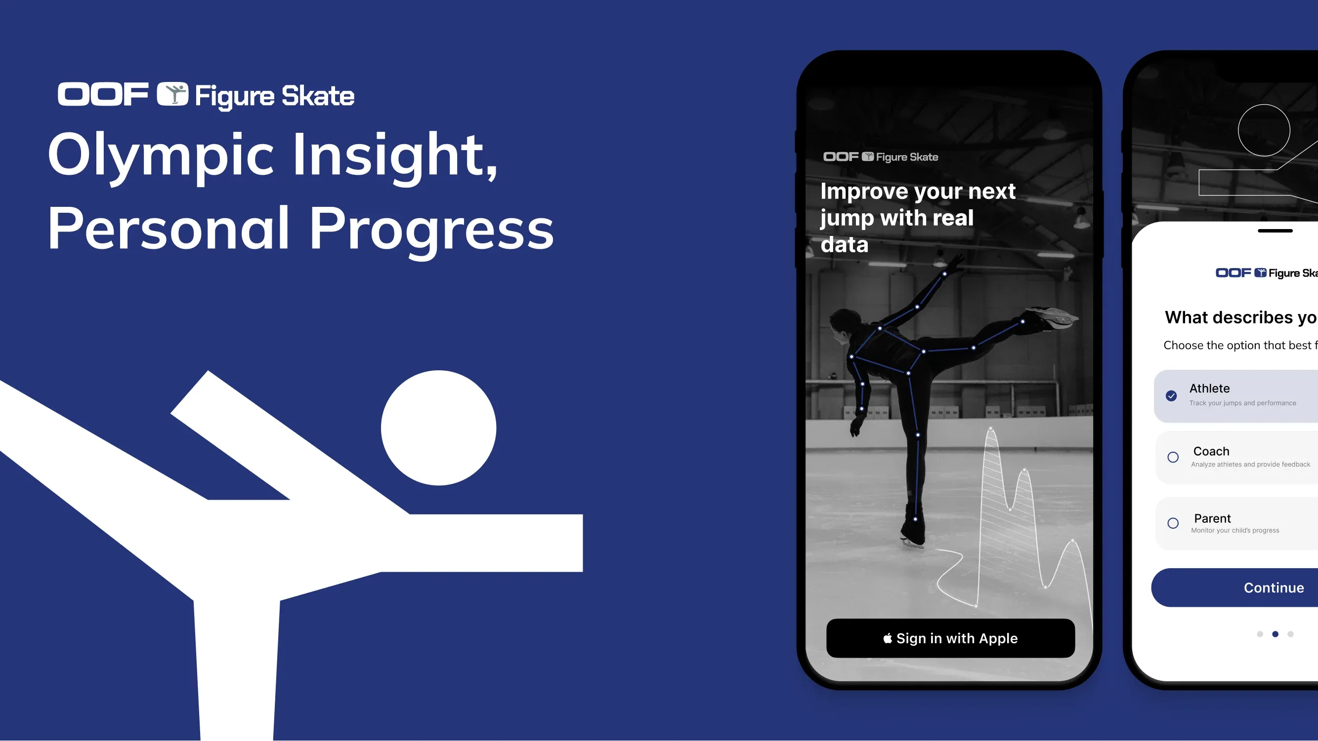
[Sample of Pitch Deck Title Slide]
Reflection
What I Learned
Learning On The Job
As the only UX Designer, and a sophomore in college, given the role of “Lead UX Designer” meant I had to learn on the job. I had to learn how to be a leader in a room of people who knew far more than me looking towards me for design direction. With each brainstorming session I challenged myself to make each meeting more productive than the previous.
Good Tools Invite Participation
FigJam was without a doubt a vital turning point in our design ideation process. Communicating my vision to engineers with little to no background in design was one of the most prominent blockers for the project. Onboarding the team onto collaborative platforms like FigJam ensured that every voice was heard and that ideas were truly being communicated effectively.